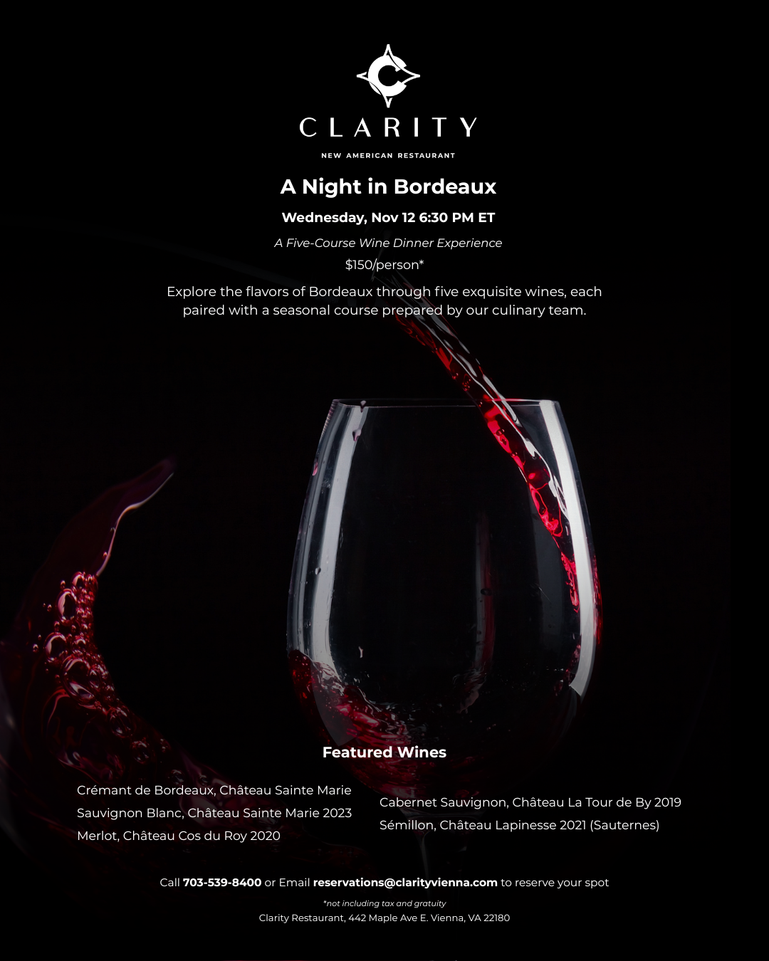
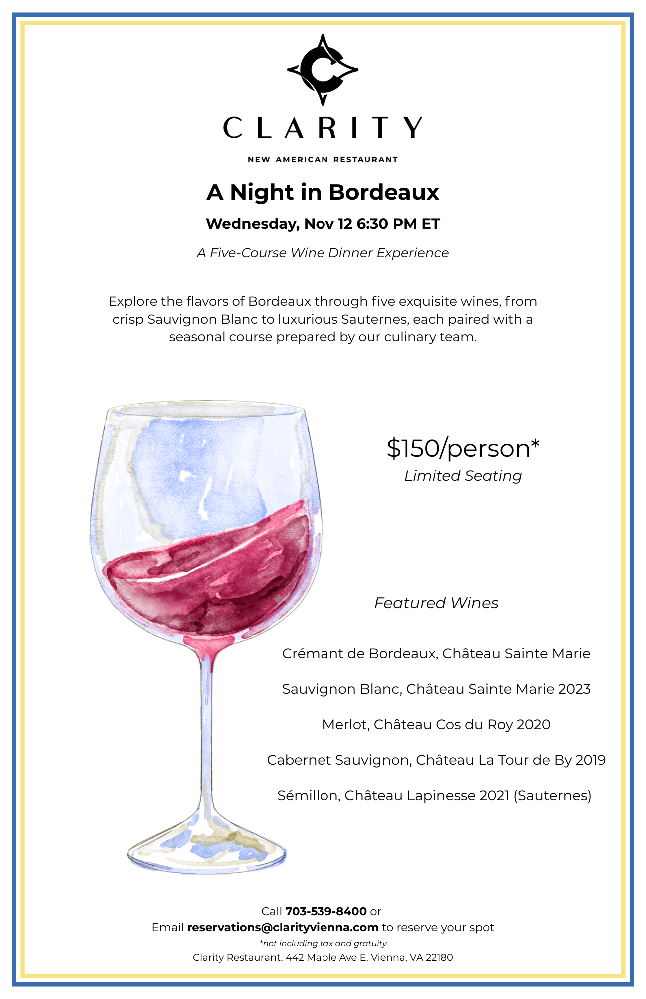
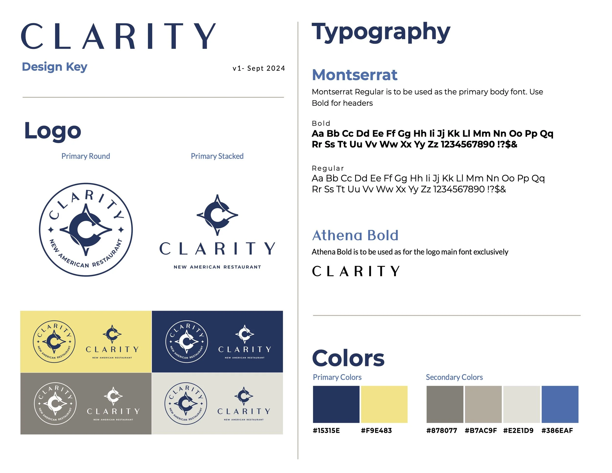
Clarity Menu and Promotional Material Design
Menu, digital and print ad design following established brand guidelines and feedback rounds.
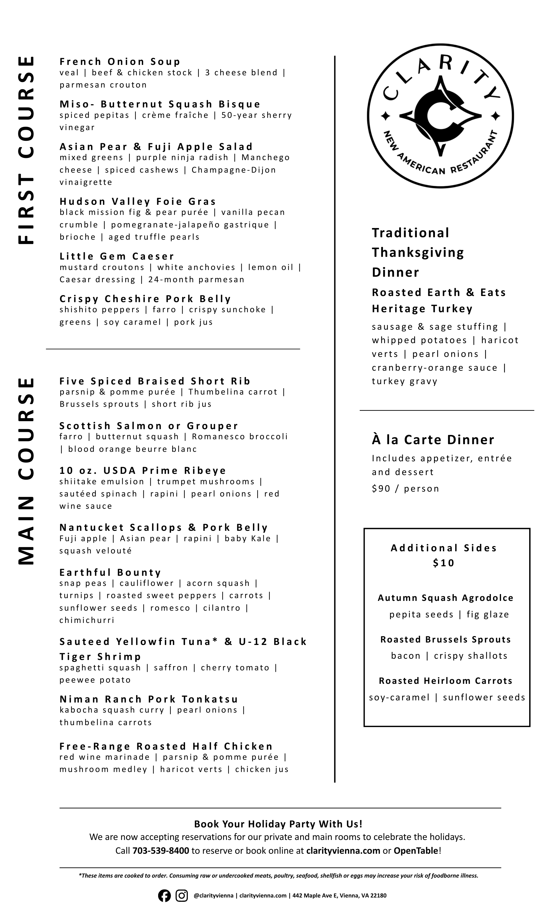
Clarity New American Restaurant identifies itself as casual upscale dining. Promotional deliverables need to match the elegance of an upscale image while not seeming out of place in the relaxed, cozy atmosphere in the restaurant and on socials. Menu deliverable was requested to match existing assets in font and layout.
Primary Round and Primary Stacked logos used for deliverables.
Primary Color #F9E483 and Secondary Color #386EAF used for supporting elements in deliverables according to request.
Logos used in black and white according to request.
Fonts incorporated according to usage specifications.